Roman Szmal watercolors - 40 shades of rainbow

This is a product review about fresh baked watercolors from Poland. So called Aquarius aquarelle is claimed to be artist grade product designed by Roman Szmal. This is an independent and objective review, with my personal thoughts and experience I had when I was testing the product for past four weeks. 

I had an early access to few of primary colors from this line about two month ago provided by my local distributor Diverse.fi as a gift. At that point I was quite tempt and hopeful to see and test more of this product. The primary colors I tried were Nickel Azo Yellow PY150, Ultramarine Blue PB29, Aquarius Red PR 214 and Van Dyck Brown NBr8. The colors behaved well in mixes and felt completely reliable, and yes I my cooked first swatches in under UV light for whole 36 hours with no pigment lost what so ever.

Once the product was officially available on Finnish market, purchased few more colors, in total 40 pans. It is 1/4 from whole line of Aquarius. The colors I chose for this product review and comparison are based totally on my preferences. How ever I tried to pick as well some pigments that would interest other viewers and artists probably more than me. I personaly don’t like browns or greens and oranges, those I mostly mix myself on palette. 

While I was choosing colors for this project,  I started to notice that my choices went often side by side with Romans personal recommendations. What can I say, guy has same taste and I probably will like his way of thinking, what comes to pigments, chemistry, and color design.I have to say in defense, I love reds and blues, I love more Cobalts and I go all bananas and unicorns when it comes to brights or complex colors like a Moonglow or Imperial Purple. So that for objective review, its all subjective from now on! 

So colors comes poured in full size pan wells, wrapped in aluminium paper and cover made from watercolor paper. Cover has name and number of color, real painted swatch of the pigment, all pigment information and q code. First thing I noticed when I was opening my pans, was big variation in consistency between pans. Pyroll Red and Aquarius red were almost honey liquid, creamy Napples Yellow Reddish and Flesh Tint were chalky, and several browns like Cyprus Burnt Umber, Caput Mortuum and Quinacridone Maroon were stone hard jelly gems. By the way Cobalt violet and Van Dyck Brown were quite hard to re wet as well. Besides that pans looks good and all information were correct… Wait! I was lucky enough to get mysterious pan with Red swatch on cover and Permament Light Green name label on it, surprisingly it was supposed to be Cherry Quinacridone but color inside were closer to dark red. Probably Pyroll Red or maybe even Aquarius Red. Well mistakes happens everywhere, and I find it personally as cute accident. It is no longer than a year from a similar episode I had with Holbain product. Wrong paint inside wrong wrap package. and even they replaced it very quickly with correct one after few emails. Here the solution was much easier. All I had to do was walk to the store and pick the correct pan, purchase replaced and I got to even keep the extra ones.

Here are presented half of my choices, i'm sorry for overexposed scan could not find exact balance with devise. The triangle goes for granulation, it is displayed in 3 stage: non granulated - semi granulated - granulated
And here are rest of the colors I included in this review. Square goes in four grade scale for opacity: transparent - semi transparent - semi opaque - opaque. Circle goes for staining also in four grade: non staining - semi staining - staining - heavily staining Colors looks bright and vibrant on Fabriano 300gr 50% cotton paper. Especially under warm light they turn more desirable and alive.
My way for making Color Wheel, by the way who recognized Jane Davenports stencil? Well I use it a lot. I like to locate colors of my palette this way and test out few of primal mixes to have a shortcuts for a future recipes.
Here are most of those swatches made as collage on rough Fabriano Artistico 300gr paper. I love this mermaid shell pattern and actually the idea for this design I got from local scrap booking and mix media artist. 
Here are mixes with primary colors Aquarius red, French Ultramarine and Nickel Azo Yellow and additional colors like Cobalt Teal, Neutral tint and Perylene Violet. I painted mixes straightly on paper in purpose to expose staining ability and behavior of pigment. The photo is over exposed, and colors looks dry more attractive under warm light in reality. Pay attention how beautifully and strongly granulates French Ultramarine. Also mix of all three primals gives us nice transparent Moonshadowly reddish gray.

Color comparison to other brands

In next few images I will be presenting how Aquarius watercolors were managing compared to brands like Horadam Schmincke and Daniel Smith. I tried to find most suitable pigments on the level of ingredients when it was possible to have a fair comparison. In those times I had no straight match I was looking for similarity in painted swatch and trying to have a best color match. I am comparing Romans product mostly to this two brand, because in my understanding this brands were partly origin of his inspiration and have left some prints in his creation.


 I left White Night out of this comparison because I have not enough matching pigments from their line and at this point it is obvious to me that mostly Aquarius watercolors are pigment rich and well color giving medium. So I’m more interested in Daniel Smiths kind separating complex colors and their behavior, mixing ability and control over smooth fine washes what comes to Schmincke. 

All swatch pages has in addition 20 minutes sketches as illustrations to display how colors behave in composition and interferes with complementary colors. Colors are used in images are purely from Romans Aquarius brand.

Roman uses a lot Nickel Azo yellow PY150 in his mixes and complex pigments, and I find it personally interesting. I think it is vibrant staining and reliable color for artists who likes new way of thinking what comes to color balance and mixing. In thicker coverage Azo yellow gives more muddy greenish results, but layered thin it is brilliant yellow. Roman has also interesting Benzymidazole colors in his line. Those are not so common in other brands what I find, and I could only find a match for yellow one from Horadam Schmincke. I chose such pigment for its not common occurrence. My third yellow is traditional Quinacridone Gold, it is Mix of PO48 and PY150. Maybe it is silly to have two similar yellows but I cold not keep my fingers of Quin. Gold. 

Illustration that goes with this colors is representing daisies. I wanted to show how Nickel Azo yellow and Quin Gold are behaving in mixes with complex Przybysz's gray. By the way no idea what that means.

Next Comes Cherry Quinacridone and Perylene Violet. I love combination of soft transparent pinkish red anddark muddy calm violet. By the way Cherry Quinacridone is my favorite for pinching portraits to look more interesting and alive. It is close to some natural redness you could find in a face. Before this swatch I always prefer Mijello over those brands, but have to admit that Romans version of colors looks to me as tasty. There were no strong variation in pinks after all, maybe Schmincke looks a bit pale to me. In other hand Romans violet is quite warm and similar to Schmincke, and Mijello and Daniels Smith stay much cooler.

This illustration represents cherry blossom and I used only this two colors and black fountain pen.

More reds comes next. Pyroll red, Perylene Rubine and Quinacridone magenda. Colors has a pigment match in four brands and there is no big variation in swatches. However Mijello and Romans paints looks more vibrant and fresh to me. This is positively promising especially because these are colors I do love.

Illustration represents our treasure Pub on the rails. It is a travelling tram van that sales around Helsinki. You could any moment hop on a ride and enjoy a beer or two.

Well with greens comparison went impossible. Even partially ingredient pigment are same different brands seems staying with their own recipes Yes there are Nickel Azo yellow and Ultramarine blue but magic happens on a levels of pigment particles as we know… So this page is more for a swatch – match, and little bit of additions. From greens I used to love all shades, that was a time when I knew a little a bout mixing colors. Nowdays I stick with olive green, especially granulating lovely deep yellowish one. And Roman has it to offer. also Romans Aquarius green seems to me as qood mimic of Daniel Smith’s Undersea green. 

And Capot Mortuum PR102, that granulates? Whaat? How you guys even do this magic? Lovely opaque creamy and heavy brown, it is like a clay with black saltpeter sparkle. The problem with this color in other brands in my opinion is, it’s boring! Okay, Sennelier has nice one, but it separates in tube. I literally milked 5 ml of honey everytime i tried to pour one on my palette, such a waist. And here its in a pan and its granulates. Great job! I hate ready browns, but I love it. Oh By the way keep in mind PR102, next page there will be more. 

Sorry for the illustration, I wasn't patient and overdid it a bit. But this's the way I prefer to do sketches. Original photo by @diapicard / pixabay

English Red Light and Pompei Red few more PR102 taunted red from plenty to choose. No strong variation in swatches. Romans are absolutely more smooth and lighter in tone. But here is question what is the difference between PR101 and PR102, why everyone else uses PR101 for this`colors?

This type of colors are difficult to me to paint with, so I went quite simple and secure with pumpkins. Original photo by @Paulbr75 /pixabay

Ultramarines: what can I say. Nothing radical at firs look. With deeper exploration I could see that Mijello is definitely odd in tone, even the brand claimed it to be light blue its definitely from darkest side. Daniel Smith varies in temperature. And Schmincke in granulation if I’m not wrong? Romans UM and FUM has slight variation in tone and in temperature. Aquarius FUM is definitely deeper and granulates stronger. It is in my opinion most versatile from those options. And maybe Daniel Smith FUM is just unique.

Illustration went quite abstract, at first I was kinda ashamed of it and wanted to replace a page, but later on I kinda learned to just accept it as it is. Hate it or like it, it's up to you :)..

Cobalt blue is another interesting color. Well here were no surprises. All looks same to me. If I really push speculation, Horadam one might be little bit on warmer side. Anyway, beautiful colors.


Decoration piece is die cut spellbinders birdies.

And now to interesting part, Cobalt Teal and Cobalt Violet. Until this point my favorite brands for Cobalt Teal were Mijello and Lucas. They had smooth and vibrant PB28 color that behaves well in mixes. Romans Cobalt Teal is compare, it is a bit warmer then Schmincke and more smooth then Daniel Smith. It also gives better color in my opinion then two mentioned earlier. 

Cobalt Violet in other hand firs made me confused and angry. You see it was one of those colors that was difficult to dilute. The pan stayed solid and my brush were just scratching the edge, and creating soapy bubbling dilution even it was pre-soaked. I took in this comparison also Rembrand from Talens, because in my understanding it is one of those colors that looks good and dilutes well from pan. Actually after deeper usage of Romans Violet cobalt I noticed it was easier to dilute then in beginning, and it became as satisfying as Rembrant one. It granulates beautifully, and can be layered thin. Mijello is still the brightest one, but isn’t it nice to have dry pane that is functional? And another funny think, Schmincke doesn’t tell the pigment? Is this synthetic color then?

Shortly about Phthalos and turquoises. Here brands separates and goes own different ways. I find more similarities in swatches of Romans and Daniel Smiths colors. Especially I chose to compare Daniel Smiths Cascade green and Romans Ocean Green not because of the color but because how they behaves. I think they are reverse versions of each others and in properly diluted wash I could find a middle ground of both colors.

In addition sketch of seagull and simple marine view. Colors function well with complementary tones like oranges and browns. Shadow violet looks good as well on the side of cold blues. In light washes ocean blue separates to turquoise and blue creating lovely natural looking patterns.

Here are some of Romans creamy colors Naples Yellow, Flesh Tint and Lavender. For record I still do not like the look of colors in the pan, and under cold light they look non attractive to me when painted. But surprisingly under warm light happens magic. Colors turns to soft warm desirable pastel kind tones. I chose reddish tones from Romans line, and I fond out it a bit problem cause I had no reddish Napples Yellow to compare to. Still I find color really creamy, and harmonic tone of yellow and I regret already that I didn’t add it in my palette at first. Lavenda is light warmish blue that behaves similar way as Daniel Smiths Lavender.

Sketch represents a harbor marina view

Here are Romans masterpieces in color design, if you ask me. I love complex separating colors because they are unpredictable and unique once they settle on paper. I think Mineral violet is great mimic of Imperial purple. They match in my eye one to one once they dry. Shadow violet I heard was supposed to be a shadowviolet? Well in my opinion its more match for Moonglow. And violetish Przybysz’s Grey in my opinion mimics Lunar violet. But in other hand Romans Shadow violet and Przybysz’s grey are also unique creations because they mimics well but looks individually different. To me it is more of the problem, what to add in pallet and what to leave behind.


The sketch represents empty Mannerheim Street with view on the Glass Palace, simplified and rough.

Romans French Ochre Is yellow and smooth, I didn’t had so good comparison colors in other brands so i introduce them as they are. Neutral tint Is deep, and in diluted washes it slightly separates in violet tone. I think its quite similar to Daniel Smiths one. Cyprus burnt Umber is much alike to a Burnt Umber. 

Image represents easily found contrast by combining neutral tint and Ochre. Reference Photo by Ulleo/ pixabay

Van Dyck  Brown NBr8 was one of those hard pans that I fought to the end to make it give color. It is transparent and granulating color. I was even confused if I had wrong pigment as a Vine Black, because I made it granulate as well in first swatches. But later on I realized that I didn’t wash brush properly and passed granulation to another pigment from Van Dyck  Browns pan.


And here are kind elephants.... Inspired by photo @comfreak /pixabay

Last but not least. Dioxazine Violet, Indigo (hue) and Aquarius Black. I have to say, rich and amazing colors both in mixes and by themselves. If you take a look in upper side of image how interestingly colors mixes with Cobalt Teal. And How strong and bold is granulation of Black. It is definitely as strong as Lunar Black from Daniel Smith series. 

Conclusions and Final Verdict

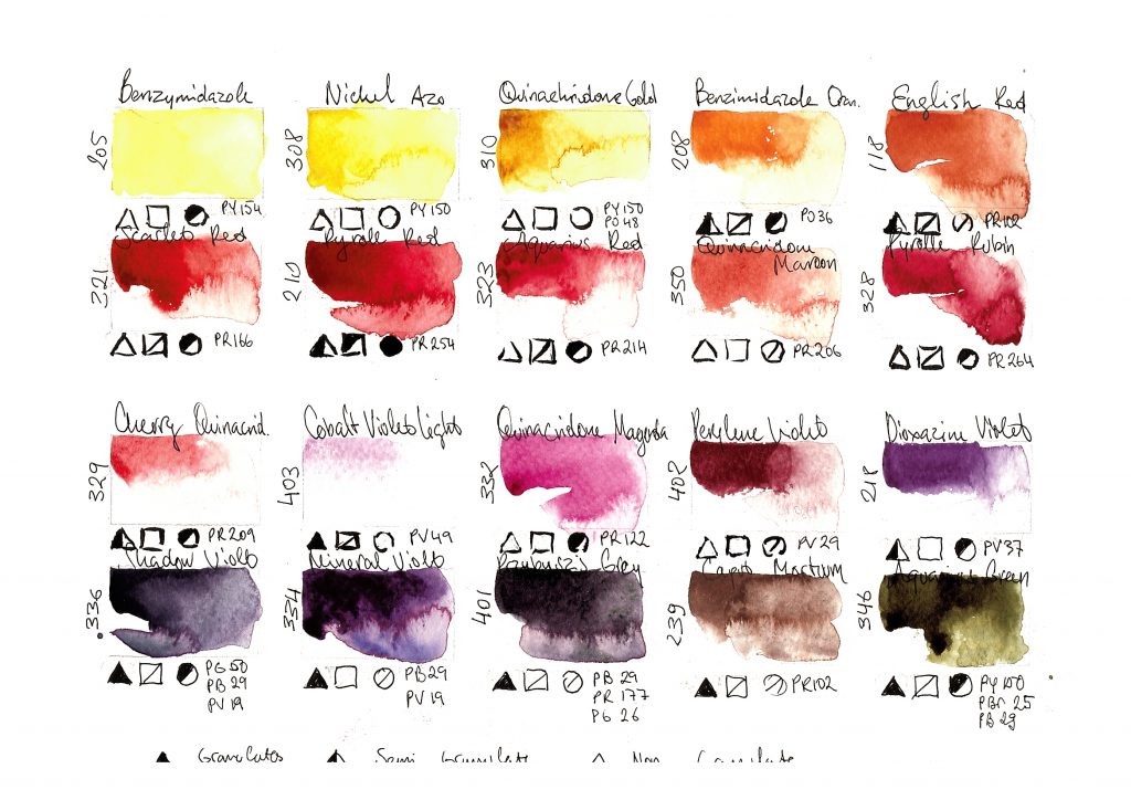
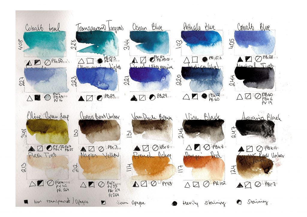
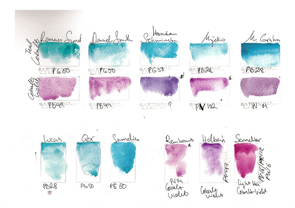
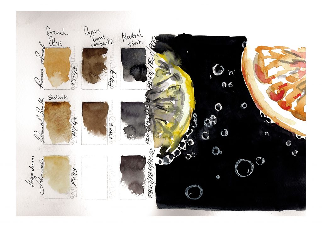
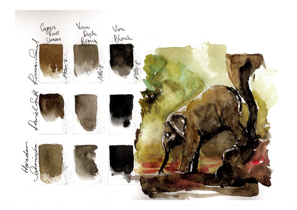
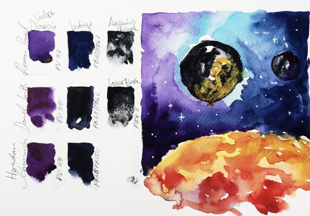
I’d like to keep under consideration the fact, that this overview and comparison are based on my personal preferences and experience. Here are presented only 40 from 160 colors of whole line by Roman Szmal. It is also very possible that paper or my way to test, mix and paint colors influence the final result and opinion about the product. Also I did my best with capturing and scanning the album and swatches afterwards. But finding neutral temperature of lighting and correct adjustments were challenging, and these colors looks much better painted and reviewed under warm light.

I did test colors for few weeks only and even manufacturer is promising excellent lightfastness in addition to artist standard medium, to me this brand is too young to say anything of lightfastness and how objectively it is tested. My first watches were placed hanging towards sun side by side with other brands at my bedroom window till next year and maybe longer. Then I’ll say something about how colors fade or does they fade at all. I have to admit that short time period I was cooking paints with UV lamp didn’t seems to damage swatches at all.

I think this brand has few minor issues, one to mention is availability  They need to work on distribution and marketing to make product easier available to customers globally. Also the consistency of paint in pans need some finalizing touch in my opinion. This is not issue for advanced painters, more a question of comfort in usage. The quality seems to be aiming for an artist grade material and on the paper it behaves like one. However it is not easiest brand to paint with, and that makes it different from White Nights.

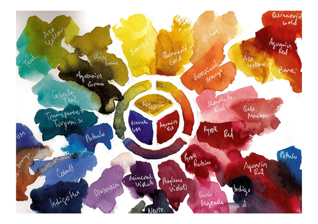
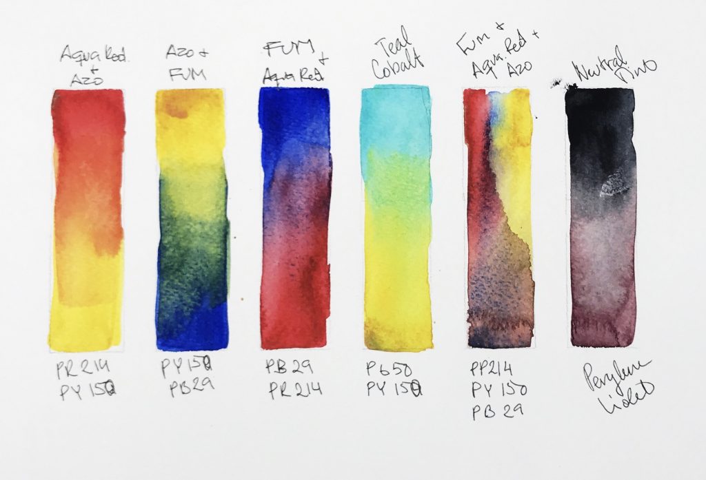
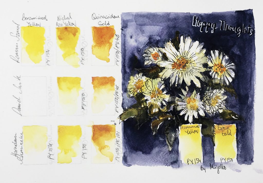
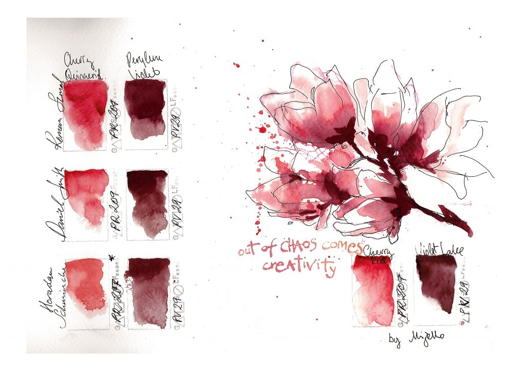
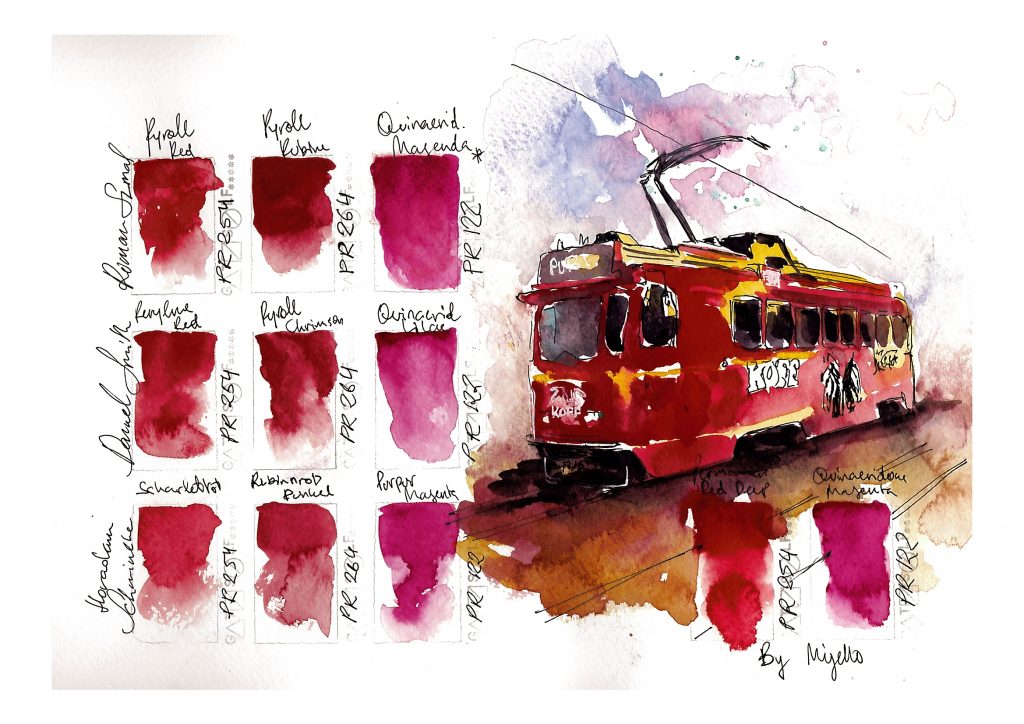
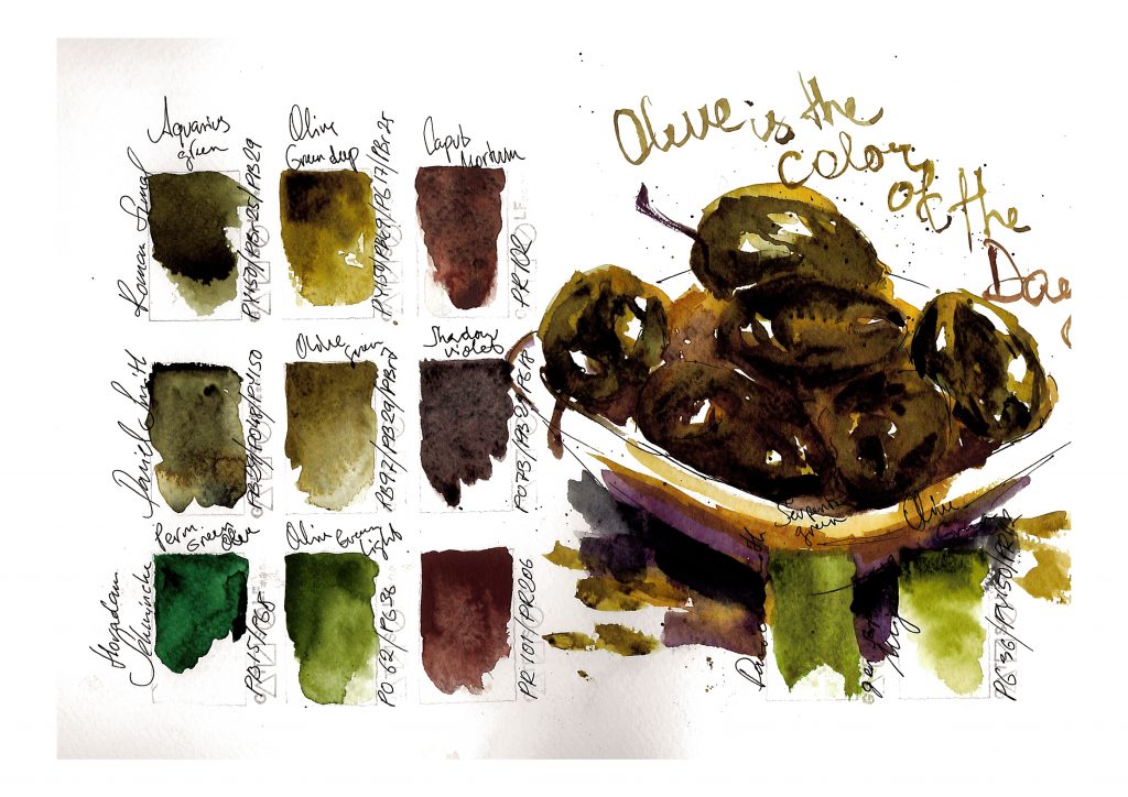
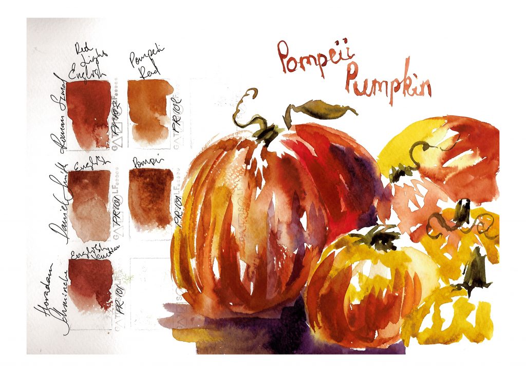
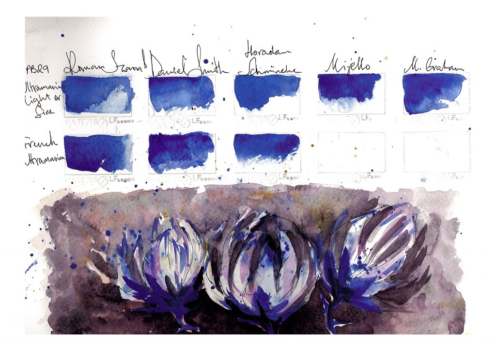
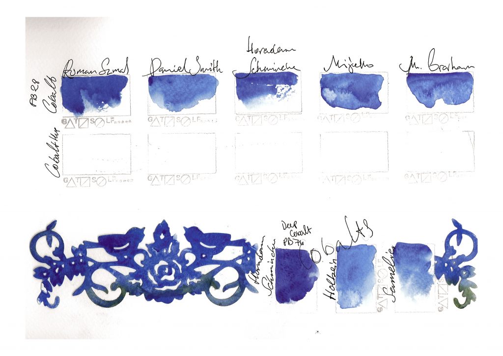
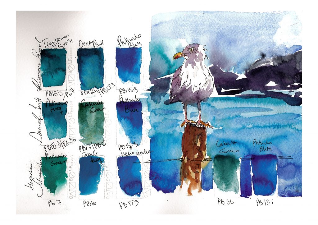
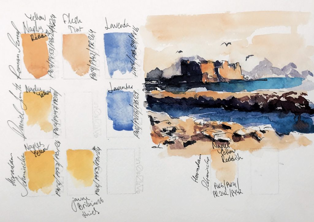
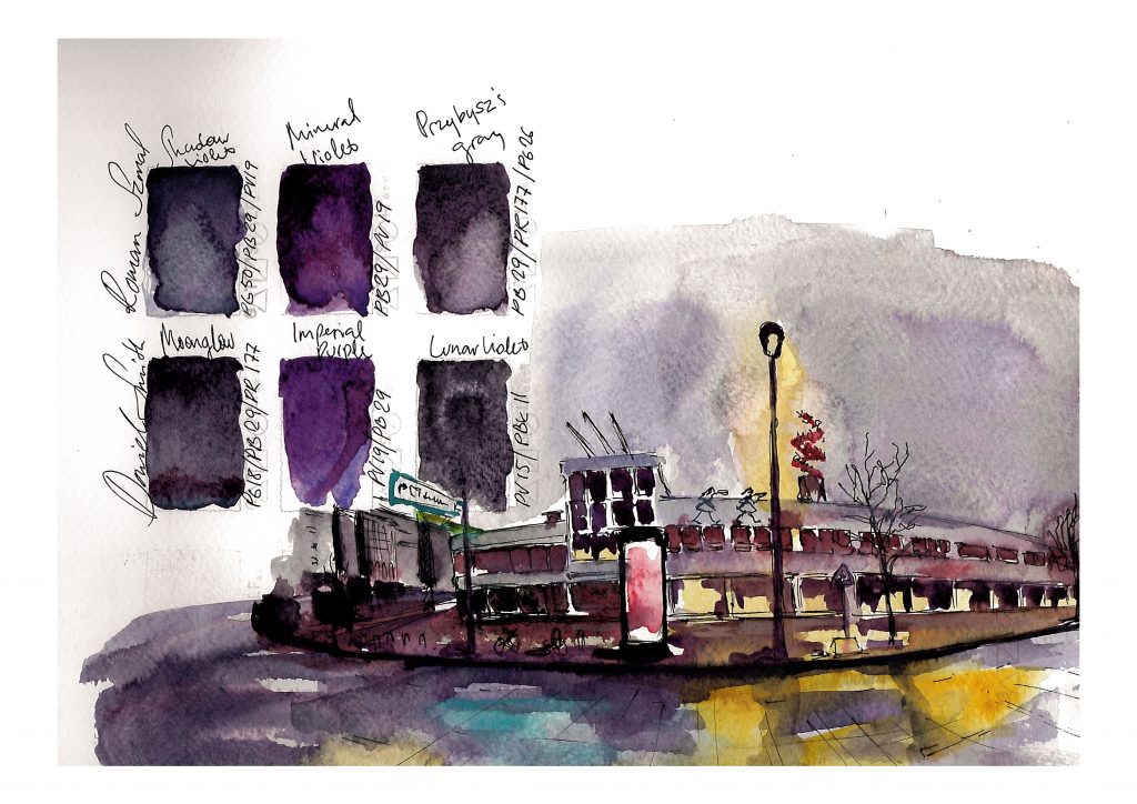
This is is the brand that combines in itself properties of greatest watercolor products. It has softness, smoothness and bold granulation. It has magical separation and repeatability. If you don’t own complex colour just simply cook it on your palette!  Those attributes makes this brand great, and also challenging to paint with for some users.  These pigments are made and chosen with the fine taste. After observing googling, comparing and wondering I have dozen of questions to Roman. How and why? His selections for represented colors in this line are definitely unique in some way, and he also please us with good mimics ’cause he know what we like already.

It was a pleasure to test this colors, and paint with it. From now on it will be one of my favourite choices to go. 

Truly yours KarsasuonTintti